In light of recent events publicized regarding the quality control issues reported with iOS 8 and Yosemite, it’s easy to forget just how much care and attention to detail exists in iOS and OS X. There are a lot of little touches and flourishes that help to create a much more pleasant experience while interacting with the operating system. Today, I’d like to focus in on a single, tiny aspect of the lock screen in iOS that makes me happy.
When iOS 7 was first released as a public beta in 2013, many were unhappy with the changes to the lock screen – specifically, the “Slide to Unlock” control that has been present since the original iPhone. Michael Heilemann (of Binary Bonsai fame) was a particularly vociferous critic of the new design. Even Gruber agreed. I also agreed with Heilemann’s critique then and agree with it, for the most part, today: there are problems.
(Note: I can’t find a copy of the original article because Binary Bonsai no longer has a blog. Sorry!)
Not much has changed to the lock screen since it was revealed (save for a direction-pointing chevron that gives the user a clue about swiping to the right and tiny Handoff icons). However, while using my phone today, I noticed a subtle touch that I think shows how detail-oriented Apple can be.
Here is how the Lock Screen appears on a device without Touch ID enabled for use to unlock the phone (or on a device without Touch ID).
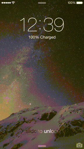
You can see the familiar shimmer of the text. There is a transition from a charging indicator if your phone is plugged in to the date after a few seconds. Pretty basic stuff. Everyone should know this routine by now. Swipe the screen, enter your passcode (if you have one), and you’re in.
Now, if you have Touch ID enabled, you’ll see something slightly different. It’s not a big difference from before, but it does help, in my opinion, reinforce the idea that you are using your fingerprint to unlock the device instead of the normal interaction mode of swiping and putting in a passcode. Here is what you’ll see with Touch ID enabled:
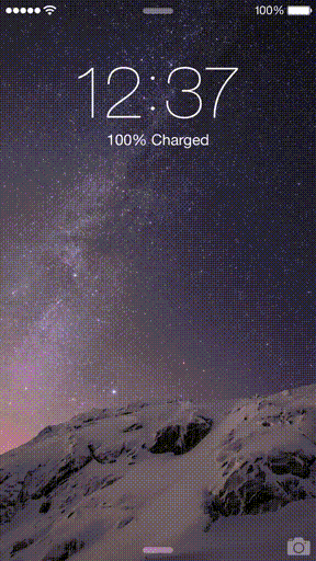
If you watch the animation from the start, you’ll see that the screen first appears with no “Slide to Unlock” displayed; that text doesn’t display until after a few seconds. The visual identity of the page is changed considerably by removing the shimmering text. So much so, that for me I know to use my fingerprint versus swiping to the right in a split second just by looking at the screen when it first appears. Muscle memory? Perhaps. After a few seconds, the text is back—more than likely to check in and make sure you do actually know how to unlock the device. To do that, it provides the familiar interaction everyone has been using since 2007.
Is this a huge difference? No. It’s subtle and thoughtful. Those two words describe the Apple I used to know and love. And, despite what others might be saying, those two words describe the Apple of today, as well. So, while there are people who cry out the “End of Apple” and who think we’re headed off a Copland-esque cliff, I see things like this and realize we’ll be all right after all.